Empathy Museum
A collaborative redesign for a participatory arts charity
Empathy Museum is a registered charity that creates participatory artworks, using storytelling and conversation to foster empathy and heal division. Their best-known work, A Mile in My Shoes, is a giant shoebox that tours the world, inviting visitors to step into someone else’s shoes and listen to their story.
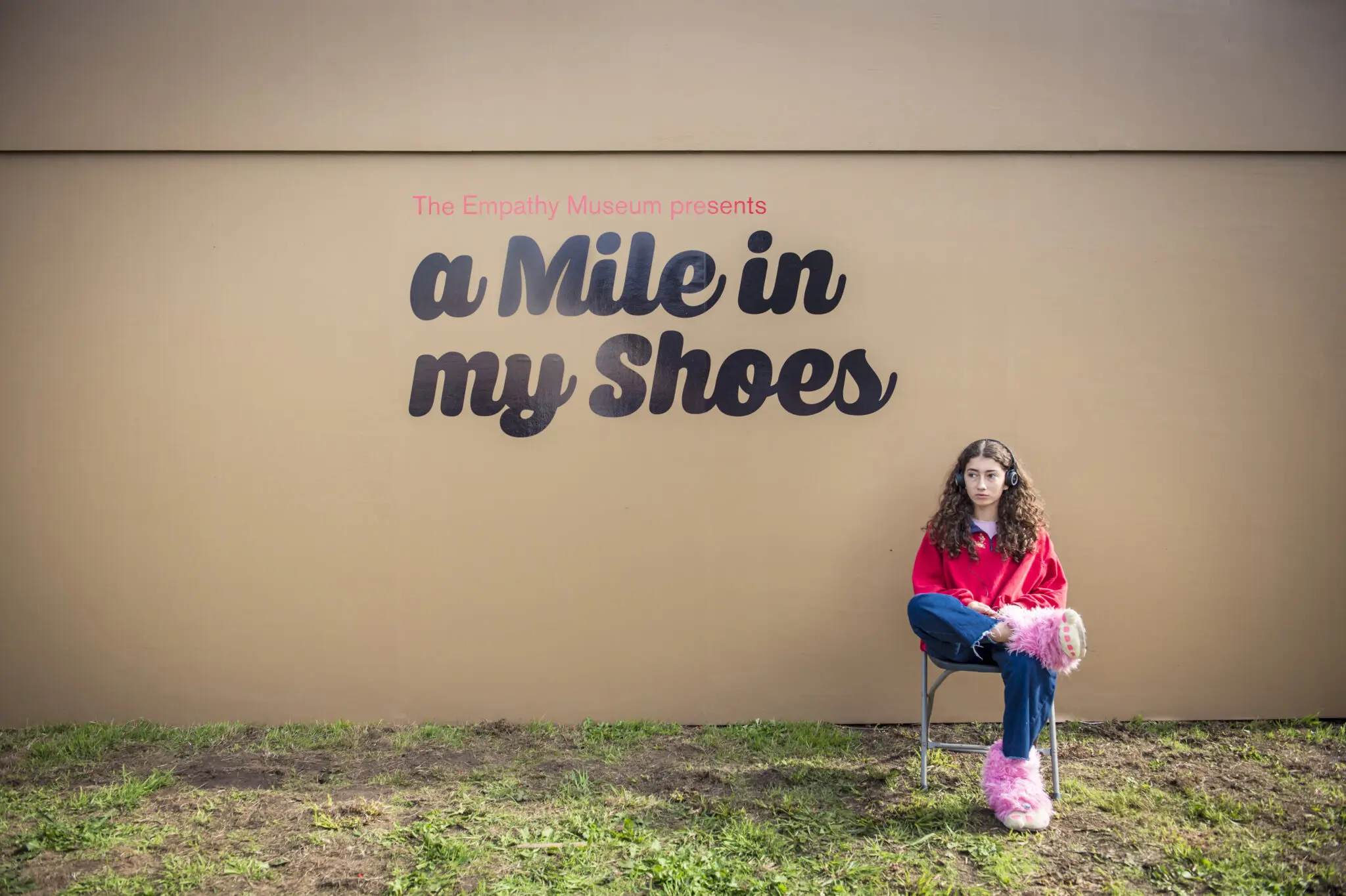
Their website was starting to show its age. It had grown organically over the years, and useful content was buried deep in the site. People often struggled to find the content they were after. Lots of white space and tall images meant lots of scrolling, especially on mobile.
The old website had started off doing one thing, but had become a number of other things over time. It wasn’t really doing what we needed it to do. People showing Empathy Museum to potential supporters struggled to find what they needed.
Empathy Museum came to me through a recommendation. For Leo, Empathy Museum’s project lead, it was important to find someone who understood the sector.
It was really important for us to work with someone who understood what smaller arts organisations need from their website. Those needs are very different from a lot of more commercial websites.

Getting analytics in place first
Empathy Museum didn’t have any working analytics when they came to me, as their Google Analytics had stopped working. So before anything else, I installed Fathom Analytics on the old site.
Fathom is a privacy-friendly analytics tool I recommend to lots of my clients. Setting it up straight away meant we could gather a few months of data while the new site was being built.
If your analytics aren’t working, set them up as soon as you can, so you’re not launching a new website with no data. Knowing which pages get traffic, where visitors come from and how many are on mobile or desktop helps shape decisions throughout a project. It also gives you something to measure the new site against.
Discovery workshop
I start every website project with a discovery phase. It helps me understand the organisation, who the website is for and what it needs to do. For the client, it’s a chance to step back, explore ideas, ask questions and get a feel for how the project will work. It sets the tone for everything that follows.
The team had already done lots of thinking and put together a detailed brief, which gave us a great head start.
We kicked off the project with a half-day remote workshop. We went through everything Empathy Museum does and looked at the current website: what was working, what wasn’t, what to keep and what to remove. We also looked at other websites the team liked the look and feel of.
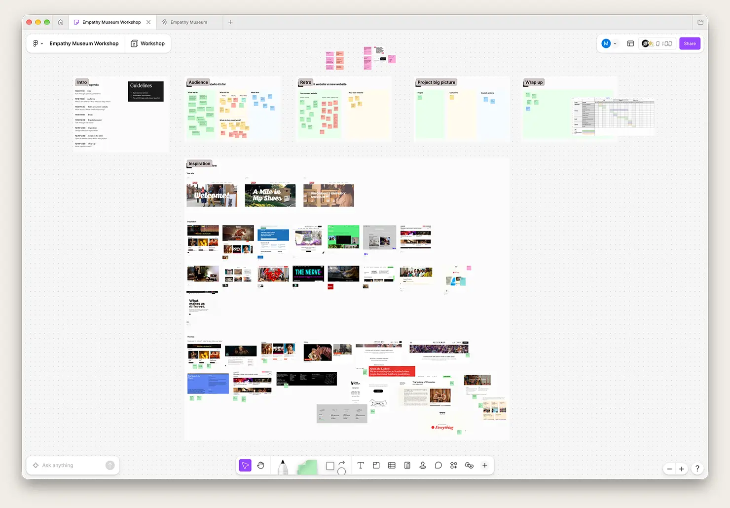
I thought the workshop was really valuable, and also revealing. It was great for us as a team to see what everyone else was thinking, and what appealed to us from other websites.

The workshop also helped bring everyone together. The team had discussed the website internally months before, but not everyone had been part of that conversation.
It was really useful to be guided by someone who knows how websites are made and knows the process. It was a really good exercise in coherence.
I want workshops to feel like a safe space, where everyone feels comfortable asking questions and sharing half-formed ideas. I know websites inside out, but the Empathy Museum team know their work and who they’re trying to reach. So it’s important we find the solution together.
I’d only been involved in this sort of process once before, and it definitely didn’t feel like the people designing the website were open to our ideas. With Marc, it felt like a very safe space to share our opinions and feedback, which I really appreciated.
Wireframing and design
Next came wireframing. Wireframes are a way of exploring layout, content and how people will move through the site. Wireframes can feel abstract, and Ed described having to “trust the process” at first.
With the structure agreed, I moved on to the visual design in Figma. I shared options side by side so we could compare different approaches together on screen, and we quickly landed on a clean layout that showed off Empathy Museum’s projects and events.
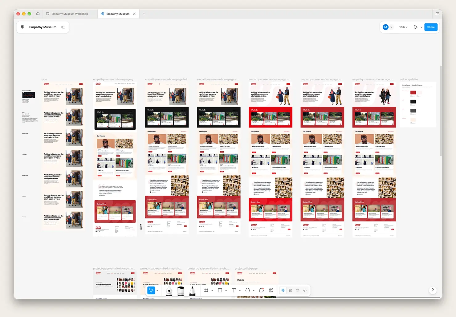
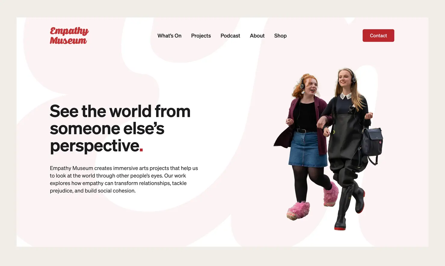
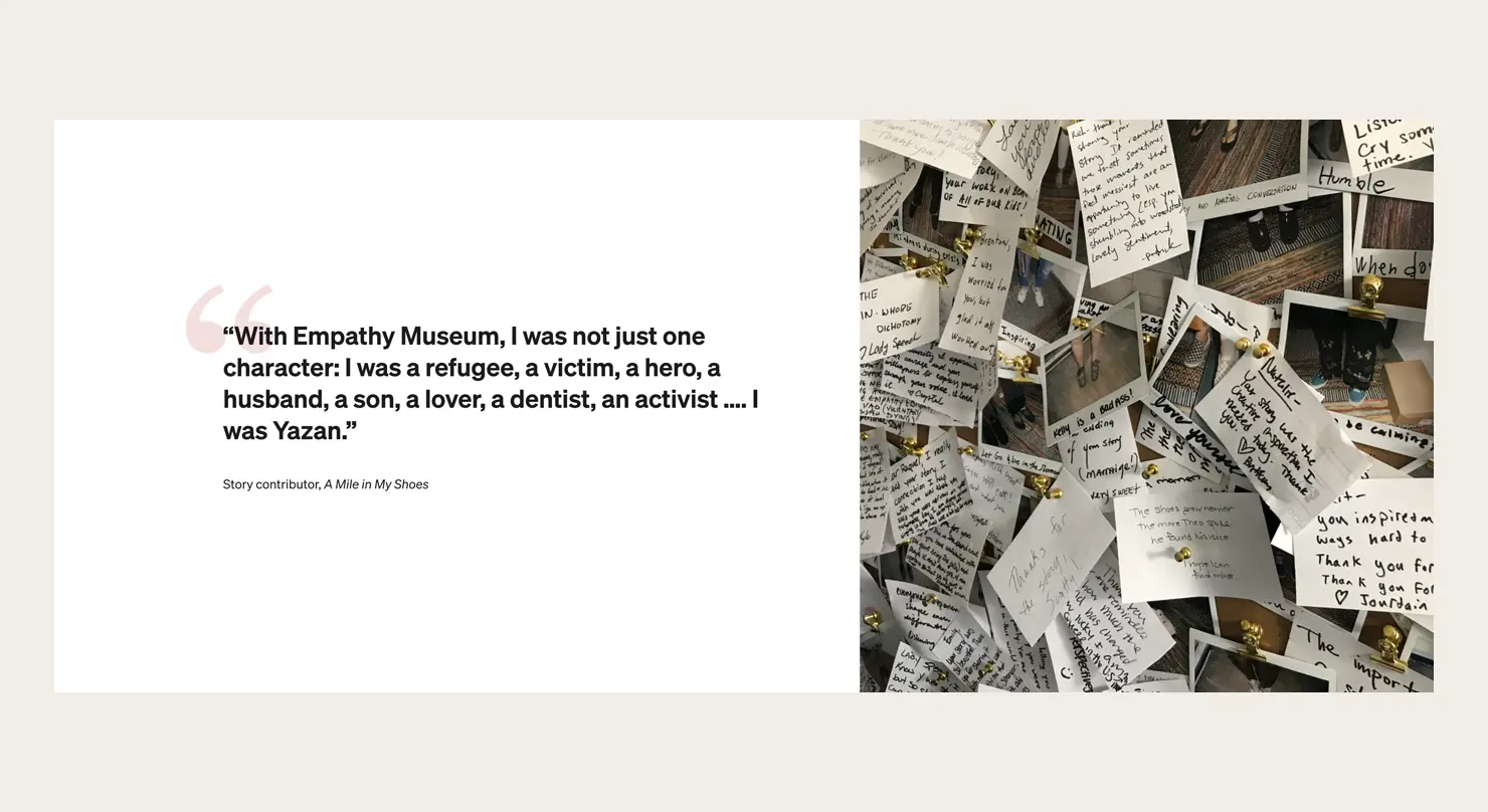
Empathy Museum’s projects have been captured by some brilliant photographers, so I wanted the design to stay out of the way. Clean, simple typography and large photos let the projects speak for themselves. I also spent a lot of time making sure the site works well on mobile.
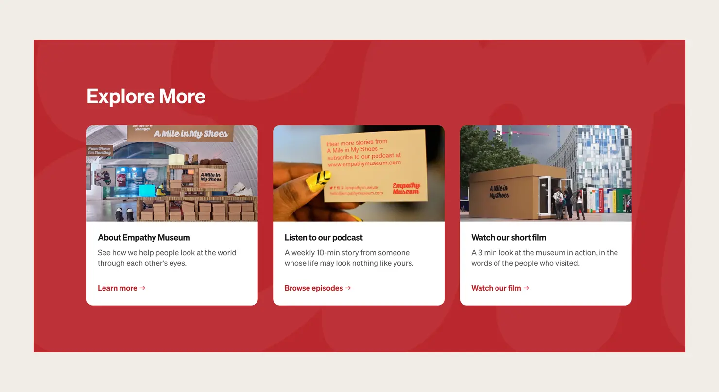
The old website didn’t naturally guide you anywhere. I wanted a design that was really clear about what comes next, and made sure everything connected. Marc got it straight away, and gave us really nice options for how it looked.
Solving problems along the way
Problems always crop up during a build, and solving them is one of my favourite parts of the job.
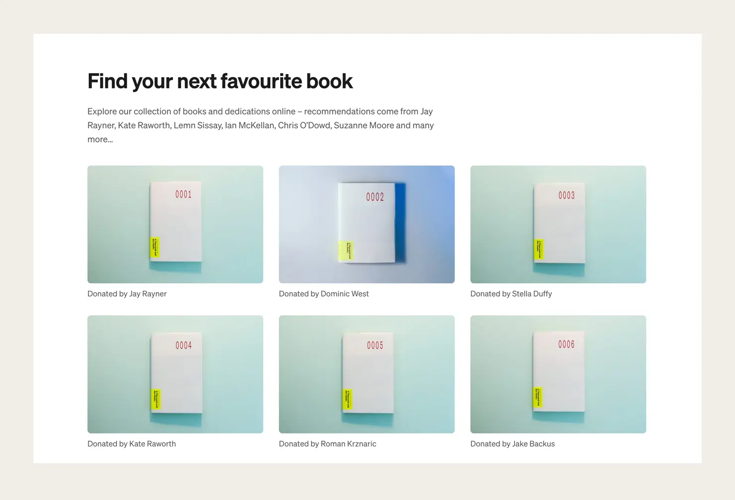
On the page for A Thousand and One Books, each book has a photo of its numbered cover alongside a photo of the book itself. Dozens of the numbered photos were missing, and recreating them would have taken the team a day or two of setting up, lighting and photographing. Instead, I took a handful of the existing photos, removed the numbers and wrote a small script to generate the missing images automatically.
It was really, really helpful, and it saved us a massive amount of work. And it looks loads better too.
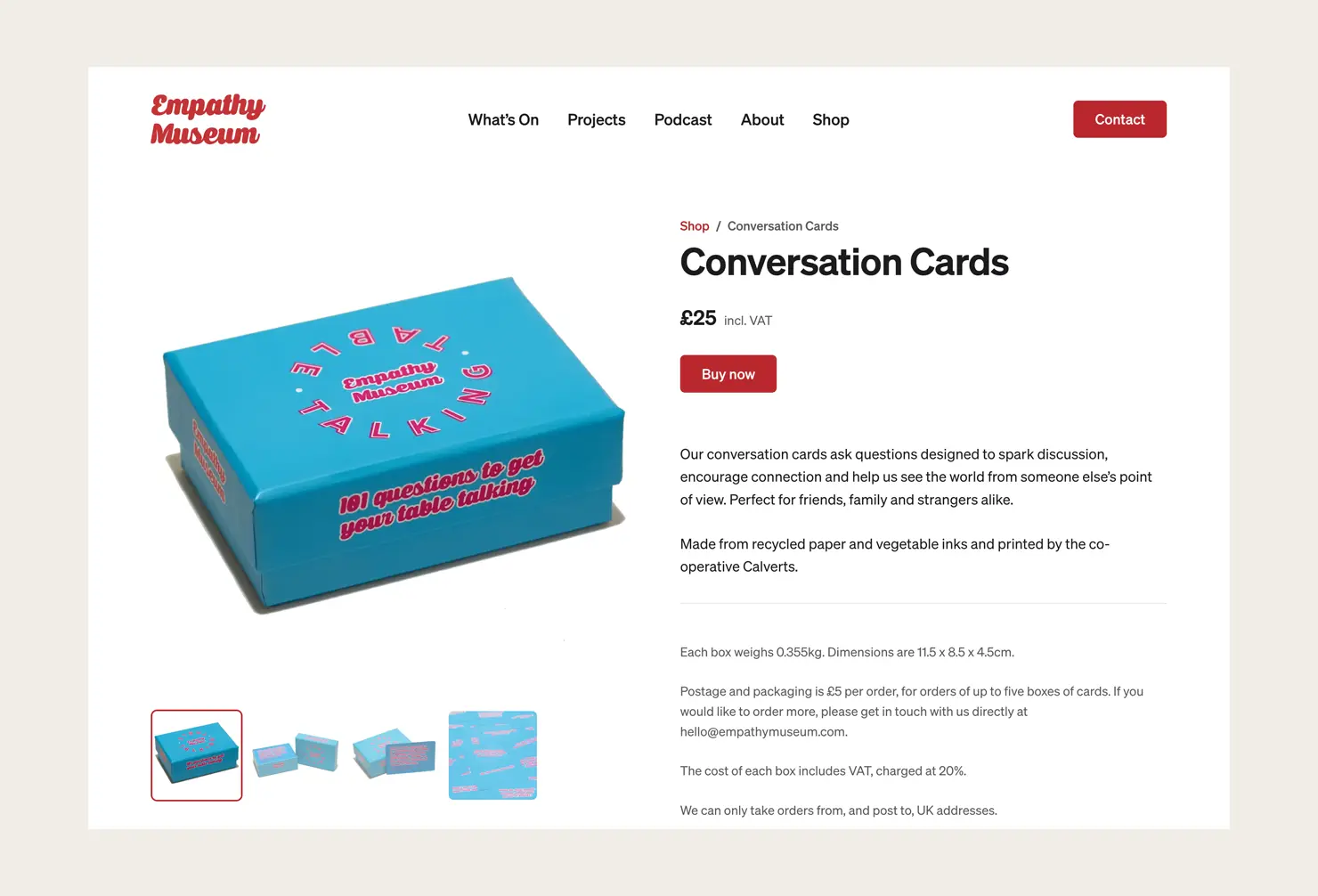
Empathy Museum’s shop used to live on a separate microsite, so I brought it into the main site. It’s deliberately simple: products are listed on the website, and checkout is handled by Square. Because no payments go through WordPress, there’s less to secure and maintain.
Built with blocks
The site is built with WordPress and Gutenberg, using custom blocks made with Advanced Custom Fields (ACF). It’s an approach I describe in my Website Redesign Handbook: build a flexible set of blocks, and the team can add and update pages themselves, without needing a developer.
Editing the new website is really intuitive. Using blocks is really nice, because as soon as you’ve changed something, you can see how it looks.
A smooth launch
A good website launch should be uneventful. The site goes live, and everything just works.
To make sure of that, I work through a detailed launch checklist that I’ve refined over many years and many launches. It covers things like checking forms send correctly, making sure everything is up to date and running a current version of PHP, turning on spam protection, and setting up caching so pages load quickly.
A big part of the checklist is SEO. A redesign can easily damage a site’s search rankings, especially when the structure changes, as it did here. So I set up redirects from old pages to their new homes and used Google Search Console to check search engines can read the site.
Clarity from the start
Clear expectations make all the difference on a project like this. My proposal set out the process step by step, and when new ideas came up that weren’t in the original brief, we talked them through and agreed them together.
When things go off the rails, it’s often because expectations weren’t properly defined at the start. Marc gave us a really good, detailed, practical response to the brief, which laid the path through the process. Being clear from the start was really beneficial, and it’s something I’d talk about if I was describing this process to other people.
There’s a kind of trust you need when you collaborate with someone, and I felt that was established really early on. Marc did things when he said he was going to do them, the meetings were regular, and no question ever felt too stupid.
Planning a website redesign?
I specialise in website redesigns for charities, museums and other purpose-led organisations. If you’re about to start a redesign, get in touch and I’d be happy to talk it through.
We would absolutely recommend Marc. He’s been very good at understanding our goals. He’s also been very patient with us, because as a team we don’t have much experience redesigning websites. The process has been incredibly smooth.